The Economics of Being a Teacher, By State
Where it's best and worst to be a public school teacher, by the numbers
I recently bumped into this article from business.org, which ranked states by average public teacher salary, yielding a “ten best and ten worst” table and a shiny map. The implication of these maps, and the discussion that follows them, almost always leads to Blue State Praise and Red State Bashing, but I find that those sorts of bashfests almost never take everything into account. I decided to try to take as many other things into account as I could, and the results are interesting.
Let’s begin.
Housing
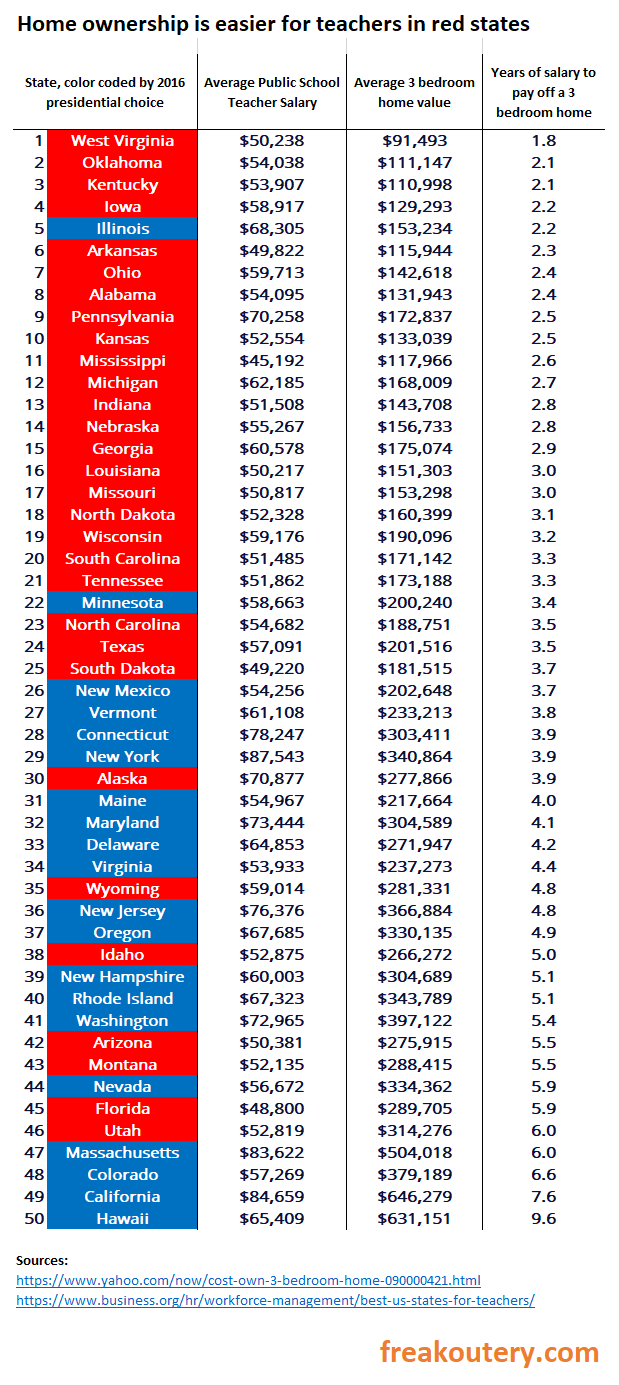
The Business.org article heaps lots of praise on California for paying their teachers so much, but it doesn’t control for one of the most important things for which we need to control when we decide whether teachers there are doing well or not - housing costs. When we account for housing costs on a state by state basis, the picture changes significantly. Here I’ve color coded “red state blue state” based on the most recent pre-Covid pre-Floyd election (2016) and sorted the table based on how quickly a teacher can buy a modest three bedroom home on the average teacher salary.
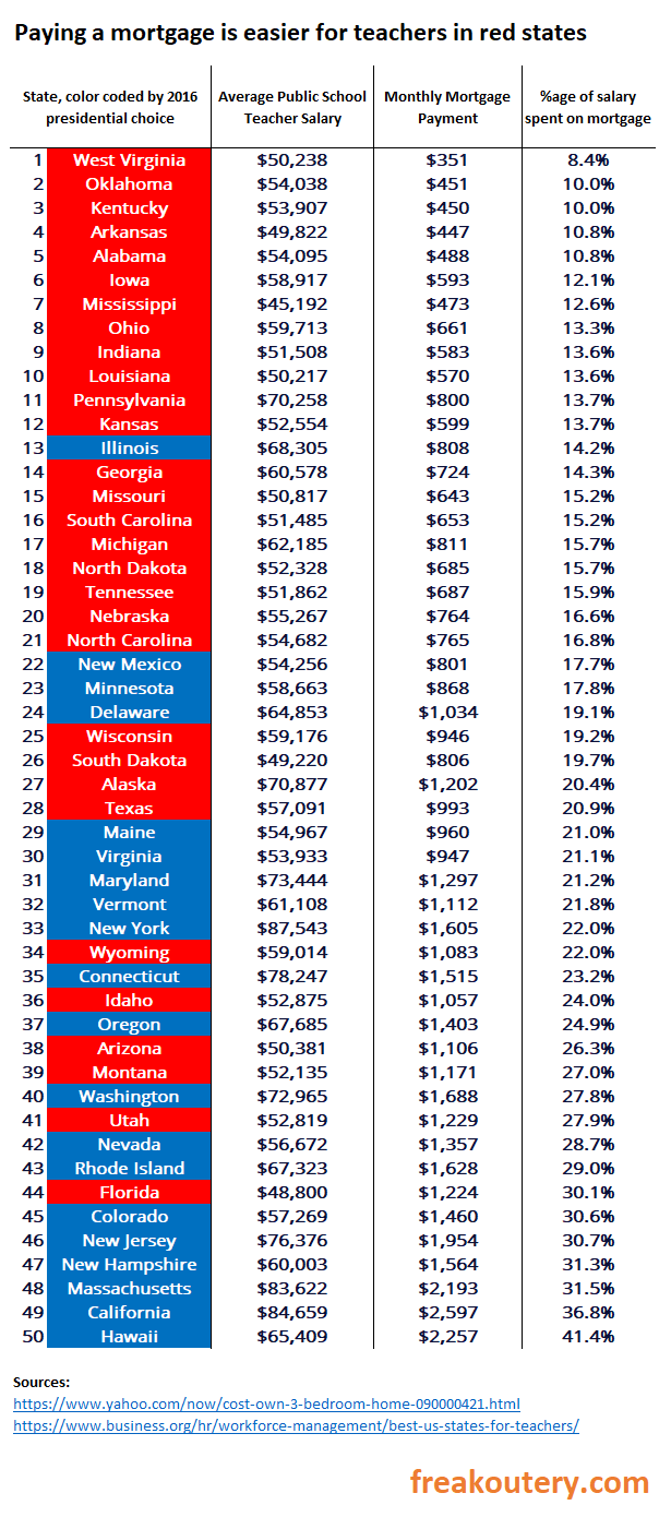
If you want to own a home outright as a teacher, move to West Virginia. Red states completely dominate blue states on this table. But that’s not a full picture, because some people don’t want to own a home outright, they just want to pay their mortgage, and the average annual payment doesn’t perfectly track the home value. From the same data source, we can make a table based on monthly mortgage payments.
Look how bad California is in this table. Their local policy of never ever allowing anyone to rezone anything and crushing the development sector with community opposition and environmental regulation is killing teachers who want to buy a home. The bottom of the list is dominated by blue states who have some flavor of this California infection, and the top 13 states where paying a mortgage is affordable are red states. More on that here, from the New York Times:
But this isn’t the full picture either, because there are other costs to living than buying a home, such as healthcare.
Healthcare
To measure healthcare costs, we are not going to use the net costs spent on healthcare, but look specifically at personal outlays for healthcare, which are more important to budgets.
Blue states tend to have more government assistance, of some flavor or another, for healthcare than red states. And although this distribution is a little less lopsided than buying a home, the most affordable places to pay for your health on a teacher’s salary trend towards the blue.
Maine and Colorado are still bad, and Georgia and Tennessee do quite well, but this table is dominated by New England largely because their teacher salaries are higher. Unfortunately, no data for Wisconsin or Wyoming exists at my link, which means we will have to strip them out of the tables to follow in this article.
What if we combine the two costs to step closer to an overall budget number?
Mortgage Plus Healthcare
The red states still do very well in this comparison because mortgage costs exceed healthcare costs. The average teacher in Hawaii pays over half of their pretax salary to the mortgage and healthcare companies. But hey, they do get the bonus of living in Hawaii, which I understand to be very fun and cool. Florida is the red outlier at the bottom because they pay their teachers poorly, and Alabama jumps to the top of the list because West Virginians are not as healthy. Sorry to be the bearer of bad news, but BMI is a factor here.
There are other costs though. Gas costs, food costs, and consumer goods in general are all affected by tax rate, and tax rates themselves differ on a state and local level. It’s very difficult to tell how much money is sunk into these sorts of costs by teachers specifically, but we can take a guess based on some published numbers.
Taxes
Taxfoundation.org does as good an attempt as I’ve seen at estimating the burden of state and local taxes on individuals per state here. It’s not perfect, but it’s the best we’re going to be able to find for our back of the envelope estimate of tax burden.
As one would expect, the red states crush the blue states on this table. Hawaii was able to sneak off the bottom, though, replaced by the usual suspects of New York, Connecticut, and California. I sorted this table not by percentage of salary spent in taxes, but based on raw dollars spent in taxes, because of where we’re going to go with the analysis next, synthesizing all three burdens into a single table so we can really start to see the impact of state policy on budget.
Mortgage + Healthcare + Tax
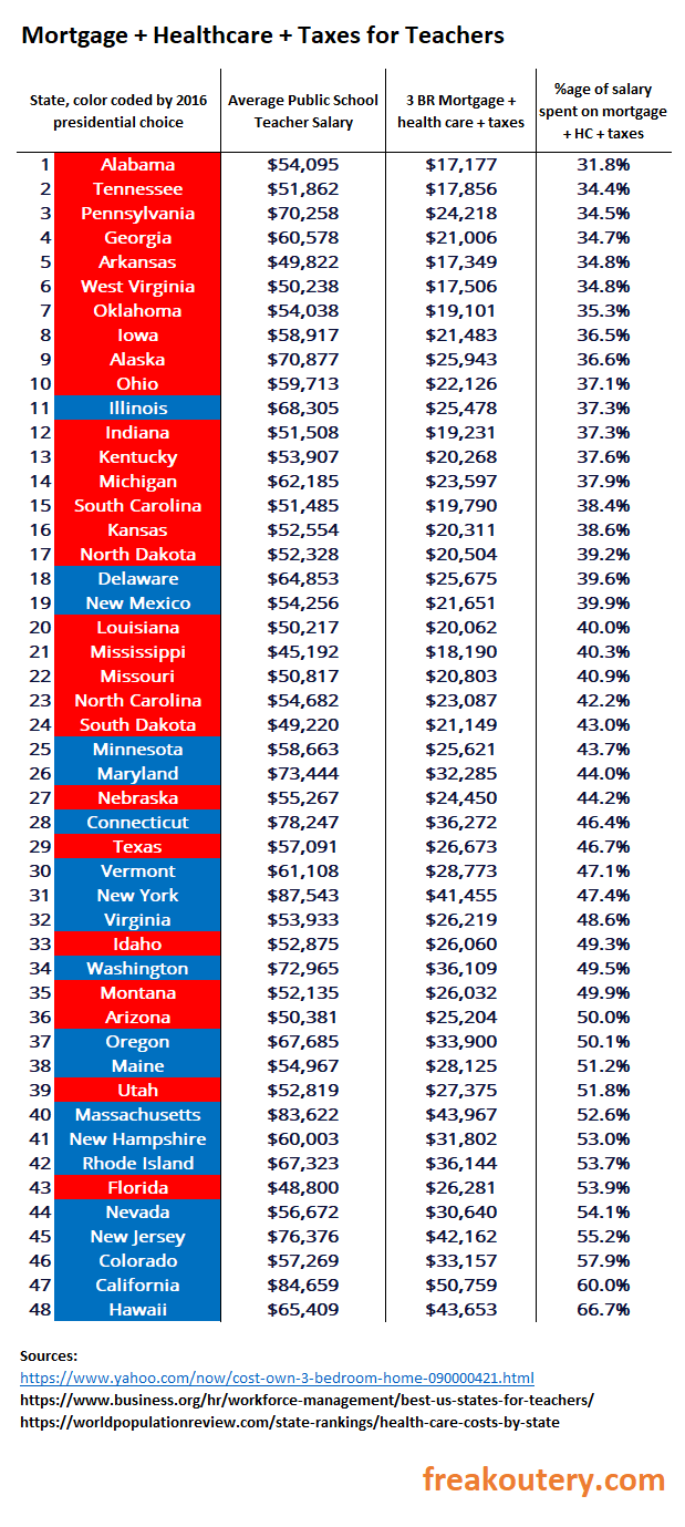
I had to strip out Wyoming and Wisconsin again because of the lack of healthcare data in the prior link. Add them up and it looks like this:
Good gracious. In Hawaii you pay two thirds of your salary to the mortgage company, the healthcare company, and the government. In California, over 60%. Living in the south, I can attest this would cause a general revolt if it were transpiring here. California’s burden is double that of Alabama’s. That’s astounding.
Why isn’t there a general revolt?
The reason why, is this analysis isn’t totally fair. California teachers pay out 60% of their earnings to taxes, mortgages, and healthcare, but they’re also clearing over $30,000 on the back end because they get paid so much. If your concern was not how much you’re paying, but how much you’re keeping on the back end, then we would need to calculate a net take-home after these costs, and sort the table that way.
Hawaii still sucks but check out New York. If you are a teacher who can live cheap, not spend a lot of money, and save or invest a percentage of what you earn every year, New York is absolutely the place to be even with it’s god awful housing costs and tax rate, because the amount you can put away before you retire to Florida (the ultimate goal of every New Yorker) is quite large. And Florida is the second worst state to save money as a teacher in the country next to Hawaii, because of the salary and because of all those New Yorkers moving south to buy houses. Alaska is great, and Georgia does well, but the northeast does very well on this metric purely because people make more money there. California isn’t great, but it’s not bad. Colorado, however, is basically the bottom of almost every table in this article.
In final analysis, the top 14 states for the amount of money teachers can bank is perfectly evenly distributed between blue and red states, but the northeast does admittedly well.
Takeaways
My impression of the analysis is that different states are going to be better for different kinds of people to choose to teach, culturally speaking. If you want a paid off three bedroom two bath in the mountains so you can teach during the week and do outdoorsy stuff on the weekends, West Virginia and many of the other red states are the obvious choice. If you’re trying to accumulate a stock portfolio and then move somewhere else when you’re done teaching to live off of your cash, then the blue northeast is actually quite a good choice. Colorado sucks by almost every metric. Alaska’s great by almost every metric. My home state of Georgia does quite well across the board.
And as usual, the culture war red-state blue-state bashfest is a lot more complicated than it looks on the surface.


Well done. I didn't take your point to be to offer the definitive metric on teacher pay. I just thought it was an effort to introduce a few additional factors that should be taken into account and see how things shake out. If that was the goal, I found this to be useful info. Thanks!
lol the methodology sucks so hard on this. First off, why use averages instead of medians for everything? Second off, this doesn't account for the fact that an affordable house might not be anywhere near where the well-paying teaching jobs are, which are usually in more expensive areas. Finally, where does student performance slot in on all of this?