Lying with Gun Data. Again.
Low grade dunking on an anti-gun dude. Presented for humor value only.
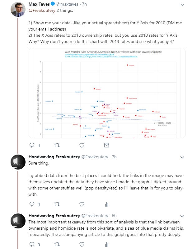
The following article (originally on Medium) was based on a mundane Twitter argument with a guy who doesn’t understand basic math back in November of 2018, and I wasn’t going to migrate it to Substack at all, except a Twitter argument erupted about it literally today so I guess I could drop it again for fun.
I only got on Twitter recently, and I think I’ve done a pretty good job overall of not picking fights on it. Fighting on Twitter is really, really dumb. For one, you never really know whether the faceless name on the other end of the twit line is an actual person, considering how the platform is totally plagued with bots. By one count, there were 72,000 bots posting for Trump and Hillary during the first debate. Over 30% of pro-Trump tweets were bots during that debate, and 20% of the pro Hillary tweets were also bots. So I vet who I talk to. And when someone with a resume that includes CNET and the Wall Street Journal, both sources I find to be really-not-too-bad in the current climate, reached out to me about a graph from the first article in the Gun Series, I was excited to have an open, data driven discussion.
Well.
That was a mistake.
But it was pretty funny, at least from my perspective, and if you’ve read any of the material on HWFO you’ll probably get a kick out of it too. It will also give us an opportunity to unpack more of the sorts of garbage games the media plays with graphs.
The image in question was the first graph from here:
https://hwfo.substack.com/p/everybodys-lying-about-the-link-between
…which is an entire article about not lying with linear bivariate trendlines. Given it’s the second highest trafficked HWFO article, I made the mistake of presuming my interlocutor read it. He really probably should have.
Begin
I entered into this exchange with an author boasting a resume of tech writing, presuming we were going to have an honest discussion about data analysis. I answered his question about data sources honestly, and I thought perhaps he’d use the excel template to insert updated data. I mentioned to him in email that one of the sketchier data sets to work with in this space is the statewide ownership rates, since polls really don’t exist for those, and the researchers cook up their own by looking at marginal ratios between gun suicide and overall suicide to project the rates. These ownership rate estimates can vary quite a bit across the research space. I thought perhaps he might want to re-cook the graph with different ownership rate sources for comparison, or such. An exercise like that might have been interesting and fruitful.
Nope.
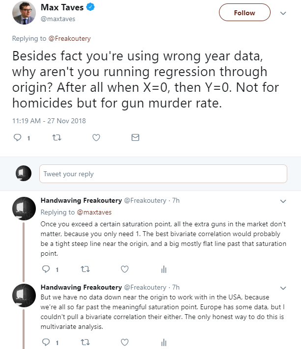
So, ignoring my answer on the data source, he seemed curiously to not understand the point of a regression analysis. The reason we do regression analysis is to try and develop a function which accurately predicts dependent variables based on independent variables. And then we measure how well the analysis fits the data. This is almost literally the whole point. Forcing a trendline to miss more of the data, just so it goes through the origin, makes the analysis less useful for forecasting.
I’ve already admitted more than once that if the Magic Gun Evaporation Fairy were to come down from space and dematerialize all the guns with her Phaser Wand, that gun homicide would go to zero. But that’s not at all useful in forecasting, owing to our palpable lack of a Magic Gun Evaporation Fairy.
Put more simply, having a trendline that’s accurate at the zero boundary is useless to us, because we will never be anywhere near that boundary.
I even dropped a discursive Easter Egg, namely that while a bivariate correlation between gun ownership and gun homicide does not exist, a weak multivariate one does, as highlighted in the article. He still didn’t read the article. I wonder in retrospect if he even knew there was an article.
So he chews on my spreadsheet, which I dutifully emailed him in the spirit of open discourse, for four hours, and then tweets out a reply.
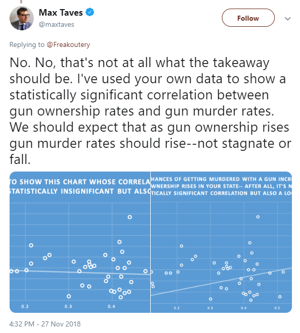
“Statistically significant.”
That’s a bold claim. A scientific claim. A falsifiable one. And one I was a bit curious about it, having chewed on this data set six ways from Sunday before, so I opened his graphs, to see what he’d done.
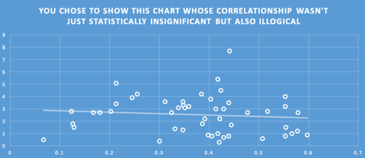
Well, good on him, he does appear to have updated some data points. That’s nice. And even with the new data, the trendline doesn’t tell us much, which again was the whole point of the original article.
But the way we determine statistical significance is with a coefficient of determination — the infamous “R²” value. Where is it?
“Also illogical” is curious rhetoric, since the lack of correlation makes perfect sense to me. Gun violence is mostly correlated to income inequality and prevalence of the prison industrial complex, and also significantly correlated to black population ratio, because of the socioeconomic trap they’re in. We discussed all that here. Further, a relatively low ownership rate can still provide for the criminal element (murderers) to be sufficiently populated with guns to commit all the murders they’d like, which is what I was trying to explain to him in the tweets regarding “saturation points” and is laid out in the Magic Fairy article linked above. But this is Twitter, where simply saying something makes it immediately true, and he’s on a roll, let’s see where he takes us.
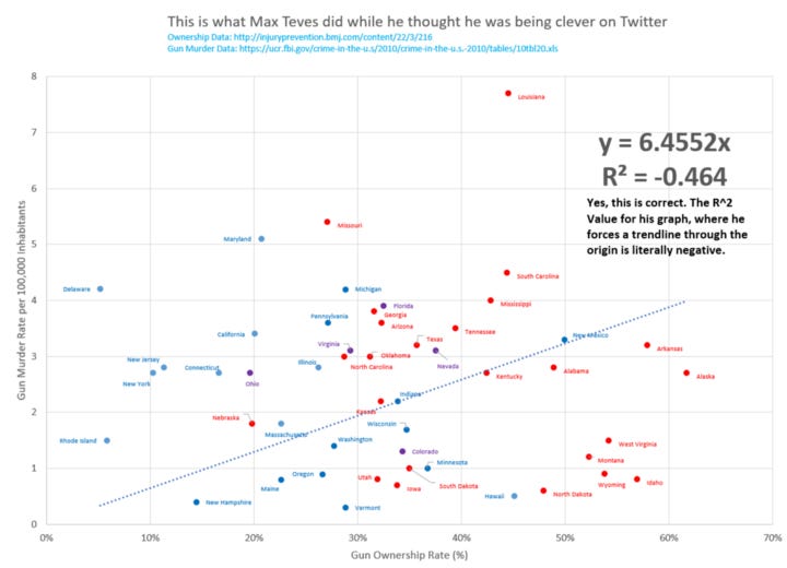
All he did was click the “set intercept to 0,0” button in Excel, to “prove” his logic. He drew the line at an angle. Does this better match the data than the trendline in the prior graph? Is, perhaps, there some way we can measure how well it fits the data? How “statistically significant” is this best fit line?
Well, first off, it is by definition less statistically significant than the one in the prior graph, because if it was more statistically significant, then Excel would have drawn the first line to look like the second. And I’ve already made the case that there’s basically no statistical significance with the first graph, with sub 0.05 R² values across the board for these sorts of data sets. International ones are similar.
So I go into the Excel file tonight after I got the kids in bed, and I click the button he clicked. Check this out. It’s hilarious.
You’ll note some different points between my graph and his, where he adjusted the ownership rate to a different data set, but the form and shape is basically the same. Poor Louisiana is still way up at the top. The coefficient of determination value of this data set, when you force it through the origin is so bad it’s negative.
Is that even possible?
Actually, yes. Negative coefficient of determinations only show up in regression models without constants (meaning they’re forced through the origin) and what they indicate is that the best fit line through the origin is worse than a horizontal line. Dang dude.
Unpacking the Rhetoric
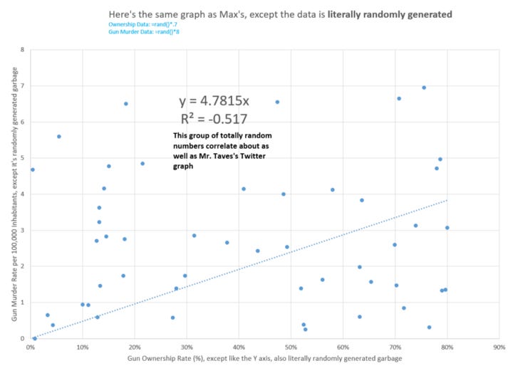
But that’s not even the worst of it, because Mr. Teves’s choice to force the trendline through the origin is not only bad math, it’s also a deeply dirty rhetorical trick. I can show you why in two graphs.
These are random numbers substituted for gun statistics. I could build a hundred of these in about three minutes. Above is a screenshot of one of them, but they all look the same. The line goes through the origin and climbs to the right because all the data are in the first quadrant of the graph. There’s no such thing as a negative murder rate, and no such thing as a negative gun ownership rate, which means any set of randomly generated data must populate what mathematicians call the “First Quadrant” of the Cartesian plane, and any line that you draw through the origin and out into the First Quadrant must climb up and to the right, because “up and to the right” is literally where the First Quadrant is.
Here’s a more extreme example, to drive the point home.
I think we can agree this data is correlated. I know this because I derived it from a function, on purpose, to be perfectly correlated. But again, if we force our trendline to intercept the origin, it must go up and to the right by default.
Max’s Coup De Grace
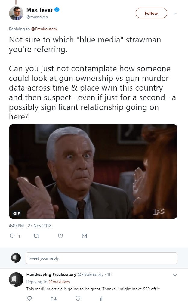
Here’s Mr. Taves again.
Now there is no way I’m going to get into an hour-long Twit Battle explaining basic math to a tech blogger, because Twitter is a garbage communication medium and honestly doing so would probably have taken me more time than it did to write this entire article, including the graphs. And even if I did, all that effort would be lost to the aether and nobody would learn from it. Further, I don’t care to educate Mr. Taves at all — I don’t think his education matters.
But if you’re reading this, and you followed along, and you notice Vox or Mother Jones (or Fox News, they’re bad too) tossing around scatter plots and best fit lines with no accompanying discussion about how well they fit the data, especially if they’re piping their trendlines through the origin to make them look good, look out.
As I mentioned recently to Benjamin Boyce on the podcast, in this day and age it’s important to be critical of all media, no matter the source, especially if it’s feeding you something you agree with ideologically. The media outlet in question is probably doing it on purpose to farm the clicks and shares. The only way to consume media at all in 2018 is to develop a very finely tuned bullshitometer.
Here’s the podcast if you missed it.




"I’ve already admitted more than once that if the Magic Gun Evaporation Fairy were to come down from space and dematerialize all the guns with her Phaser Wand, that gun homicide would go to zero."
And then somewhere between T+2 and T+24 hours, we would have our first post-fairy gun murder, because a completely disarmed populace is ripe for the picking and firearms are 600 year old technology that is trivial to manufacture in the present day.
Never mind the catastrophic increase that a zero gun world would suffer in other violent crimes as all the criminally inclined realize that they're suddenly very unlikely to get shot while engaging what they're already better than most law-abiding in committing: physical violence.
Hey I think there's some confusion. I can't find anyone who reopened the discussion on Twitter today or even in the last year, but it looks like less than an hour ago you just responded to a tweet from 2018. Help?
You're completely right, by the way. I'm just trying to figure out which one of them responded or who brought this conversation back up again after all of this time.