Since Biden and Harris are having their annual “tweet about the gender wage gap” day, I figured it would be a good day to post some graphs that explain the gender wage gap as best as science can currently describe it.
Source
Folks on the right say “the gender wage gap isn’t real!” and that’s explicitly not true. Folks on the left say “gender discrimination is reducing women’s wages by 20%!” and that is also explicitly not true.
When you peel this argument apart, the great confusing kerfuffle about the wage gap is about how much of the gap is actually discrimination, and how much is due to other factors. People can argue themselves blue in the teeth over this, on one side or the other, but the only mathematical way to determine the answer is with something we call a “multivariate analysis.” You need a giant database of every possible thing that could impact wages, broken down by gender, and then you do a tremendous amount of math to disentangle each possible factor from the other in order to determine how much each factor actually contributes. These things are hard to come by.
Thankfully the Department of Labor did it for us, in 2009, based on 2007 data. Here’s a link to the study. This is not a study done by a culture warrior on the left, nor a culture warrior on the right. It’s a study done by some statisticians on contract to the Department of Labor, with a forward written by the Department of Labor itself. And to my knowledge, no follow-up study has ever been commissioned even though the gap continues to slowly shrink.
Excerpts and Graphs
In 1970, the median usual weekly earnings for women working full-time was only 62.1 percent of those for men; by 2007, the raw wage gap had shrunk from 37.9 percent to just 21.5 percent. However, despite these gains the raw wage gap continues to be used in misleading ways to advance public policy agendas without fully explaining the reasons behind the gap. The purpose of this report is to identify the reasons that explain the wage gap in order to more fully inform policymakers and the public.
There are observable differences in the attributes of men and women that account for most of the wage gap. Statistical analysis that includes those variables has produced results that collectively account for between 65.1 and 76.4 percent of a raw gender wage gap of 20.4 percent, and thereby leave an adjusted gender wage gap that is between 4.8 and 7.1 percent. These variables include:
A greater percentage of women than men tend to work part-time. Part-time work tends to pay less than full-time work.
A greater percentage of women than men tend to leave the labor force for child birth, child care and elder care. Some of the wage gap is explained by the percentage of women who were not in the labor force during previous years, the age of women, and the number of children in the home.
Women, especially working mothers, tend to value “family friendly” workplace policies more than men. Some of the wage gap is explained by industry and occupation, particularly, the percentage of women who work in the industry and occupation.
Research also suggests that differences not incorporated into the model due to data limitations may account for part of the remaining gap. Specifically, CONSAD’s model and much of the literature, including the Bureau of Labor Statistics Highlights of Women’s Earnings, focus on wages rather than total compensation. Research indicates that women may value non-wage benefits more than men do, and as a result prefer to take a greater portion of their compensation in the form of health insurance and other fringe benefits.
Although additional research in this area is clearly needed, this study leads to the unambiguous conclusion that the differences in the compensation of men and women are the result of a multitude of factors and that the raw wage gap should not be used as the basis to justify corrective action. Indeed, there may be nothing to correct. The differences in raw wages may be almost entirely the result of the individual choices being made by both male and female workers.
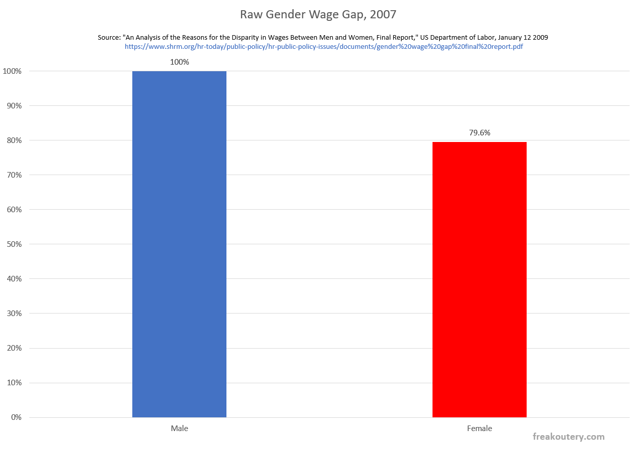
Let’s graph this. As a disclaimer, there are error bars in the study that I’m choosing to ignore for the sake of clear data visualization for the muggles. Here is the raw gender wage gap of 20.4% as measured in 2007.
Looks pretty big, and this is the thing the left hammers on yearly. They even made their own special holiday for it to manufacture media coverage. This is the raw wage gap, which is measurable and very real. It’s simply looking at the amount of money each gender makes, without considering any of the “whys” about it.
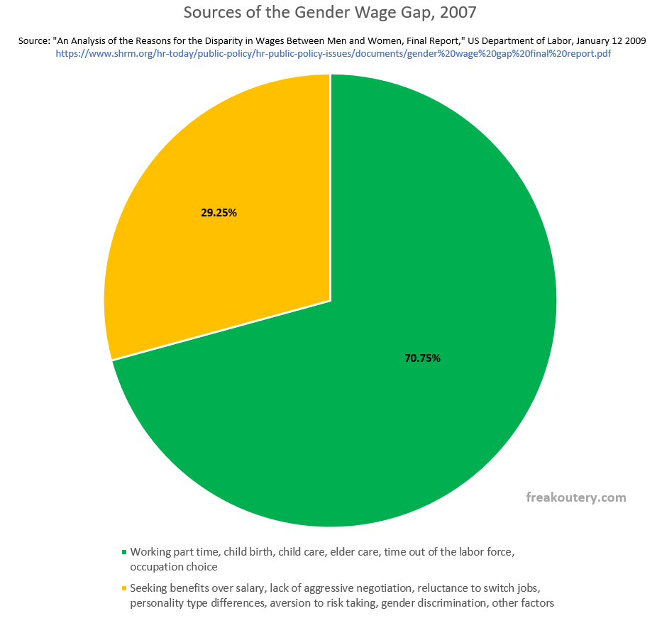
The Department of Labor analysis took every valid piece of data they could find in government databases, and controlled for the aforementioned factors, to figure out where that 20.4% went. Here’s a pie chart of what they were able to explain with multivariate analysis, and what they weren’t.
A little under a third of the gap was not explainable by their data. They didn’t have data on how many women seek benefits over salary, how less likely women are to switch jobs seeking better pay, or how less likely women were to ask for raises or aggressively negotiate. They didn’t account for personality types that might influence the aforementioned factors. And they also obviously couldn’t directly measure any legitimate gender discrimination in the workforce.
But they could and did measure the career choices women make, largely to accommodate baby making, child rearing, and their general societal role as caregivers. To be very fair and very clear, “choices” is not the best word, because some of these choices were not their own. Somewhere around 80% of single parents are mothers, for a variety of reasons, and women are not to blame for some of those reasons. I know this personally, because I’m a single father widower with two elementary school kids. I did not choose to be a single parent, but my situation forbids me from taking a job in a typical engineering office environment. Four fifths of single parents are women. All this factors in. But fair or unfair, those effects on the wage gap are not gender discrimination, so they can be thrown out once they’re identified.
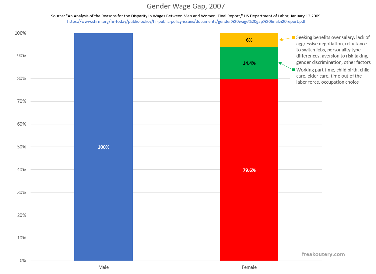
That pie chart looks big and intimidating for psychological data representation reasons, but it is a ratio of the gap itself, so to best visualize it we need to squeeze it back onto the bar chart at the beginning. Like this.
The little orange sliver in the top right corner is every factor they couldn’t measure, which would include but is not limited to gender discrimination. Let’s talk about what this means.
If we went back in time to 2007, and waved a magic gender wage wand over the country which eliminated not only gender discrimination but also converted women’s genetic personality type distribution over to into men’s personality type distribution, increased their risk taking propensity, their willingness to negotiate, and such, and also magically fixed any other factors I can’t think of at the moment, the wage gap would only close by 6%. If our magic wand only eliminated gender discrimination and left all the other stuff unchanged, the gender wage gap would close by some number noticeably less than 6%. The rest of the gap is interminably tied to how we as a culture make babies.
The 2021 wage gap has dropped from 20.4% to 18%. Did this 2.4% reduction since 2007 come out of the orange bit of the graph or the green bit of the graph? Nobody knows, because nobody has since replicated the Department of Labor’s study as far as I’m aware. Some of it could be due to a reduction in overall gender discrimination against women in the workplace. Part of this closure assuredly flows from women significantly outnumbering men in college. There’s also a distinct possibility that part of this gap closure is gender discrimination against men. Certain progressive companies, when they analyze their actual employment data, find that they are actually paying women more money for equal work than they are men, such as Google. Is this common? I don’t know. Perhaps part of this shift is some companies are discriminating against women while others are discriminating against men and there’s a shift in the equilibrium point.
Let’s go back to the 6% number of 2007. If gender discrimination was only accountable for, say, a quarter of the 6% unexplainable gap in 2007, and the green bar stayed the same for the past few decades, then that would mean that our magic wand eliminating gender discrimination in the work force would increase men’s pay by 0.9%.
But we don’t know the numbers, because nobody’s done the analysis.
And cynically, I think some people like it that way.


This issue is one of the best examples of a culture that preaches "follow the science" with religious fervor, but doesn't really want to look into the dark places that science inevitably points.
I don't know if it was factored into the study (I only had time for a few quick keyword searches, and didn't see it) but I frequently hear commentators making the point that men's personalities (general interest bias toward "things") vs women's personalities (general interest bias toward "people") results in an imbalance as well. One woman, working as a nurse, can only do so much nursing. In that way, her ability to generate economic value is inherently capped. Conversely, one man, who let's say invents a widget that increases nursing efficiency by 1%, can have that improvement propagated globally, resulting in the generation of vastly more economic value.
In that sense, there is a Marx-ish assumption lying at the bottom of the "20% wage gap" argument. That being that all units of labor are of equal value.
Oh, and a nit: Sometime mid-20th century, there was a language shift that we should undo. We replaced "sex" with "gender", presumably because of middle-American squeamishness over the word "sex".
I think it is past time to un-do that damage.
IMHO, the word "sex" should be preferred in the context of this article. "Gender" has become infinitely fluid, and more or less stripped of all meaning.
Would have loved to have been a fly on the wall in some of the meetings after this study was published.