As HWFO readers know, the media’s market incentive for clickbait prevents them from ever, not even once, depicting data correctly. If data depicted correctly doesn’t incite outrage or promulgate culture war, they will either throw the data out, or reengineer their presentation of it such that it does, because outrage is their job. So it’s no surprise that when I talk to my friends in Blue circles they are unilaterally of the opinion that the USA’s response to Covid-19 was literally the worst, worldwide.
But when I look at the data, and do honest comparisons with other countries, the USA is objectively not the worst, and should rather be characterized as “pretty bad but vaguely in line with a lot of other countries in our predicament.” Let’s look at some honest graphs.
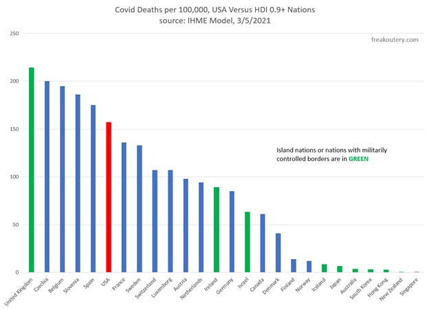
A common theme within the Blue Tribe is “Europe does everything better than the USA does.” And they almost always focus on prior Western Block countries, NATO members before the wall fell. Here we see Covid deaths per capita among these countries, with the USA in red. The UK is absolutely the worst, Belgium Spain and Italy are bad, we’re behind Italy and tied with Portugal, and France and Sweden aren’t faring too much better than we are. Finland is the only country over there that’s rocking it. How did Finland do it? It’s titty popping cold, hard to get into, they have more secure borders than most of the rest of the EU, and they did a whole bunch of contact tracing. Denmark doesn’t look to bad either, but they are a peninsula and an island chain with a very small and easily controlled contiguous border. More on that later.
The USA is “pretty bad but vaguely in line” in this bar graph.
Data in the bar graph comes from the IHME Covid-19 Model, which is one of the best resources available online to compare Covid-19 in countries over time.
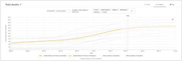
This is a snapshot of the IHME model, with the USA in yellow and each of the bar graphed countries in grey, on a per capita basis. Covid-19 has varied throughout the epidemic, and the USA is again “pretty bad but vaguely in line” with our comp countries.
But we’re missing some other important comparisons. Australia and South Korea and New Zealand are all highlighted in the media as success stories for Covid-19 control. Let’s look at a wider batch of data, including all the world countries with a Human Development Index over 0.9, what we might call the top tier of the first world.
Singapore is an island nation with an easily controlled border. New Zealand is an island nation with a moat the size of the entire South Pacific. Hong Kong is an island with a tightly controlled military border. South Korea is a peninsula with a wall Trump could only dream of. Australia is an island nation with patrols to prevent illegal Philippine immigration against whom they’re marginally racist. Japan is an island country currently building warships since we finally let them, who is also tremendously racist against the Chinese. Iceland is an island nation with a moat the size of the North Atlantic. Nobody walks into Finland. Denmark is a peninsula with a very small contiguous land border, patrolled on the other side by Germans.
These are the countries where contact tracing worked. In the early days of contact tracing, South Korea was pushing out 100 tests per 1 confirmed case. No country in the world could issue that many tests unless they could completely lock down their borders before things got bad, and a lot of countries were screwed before they knew it. To test enough to do contact tracing during the USA December 2020 wave, we would have had to test 8% of our entire population every single day. No country could bear that burden unless their starting position for infections was very low.
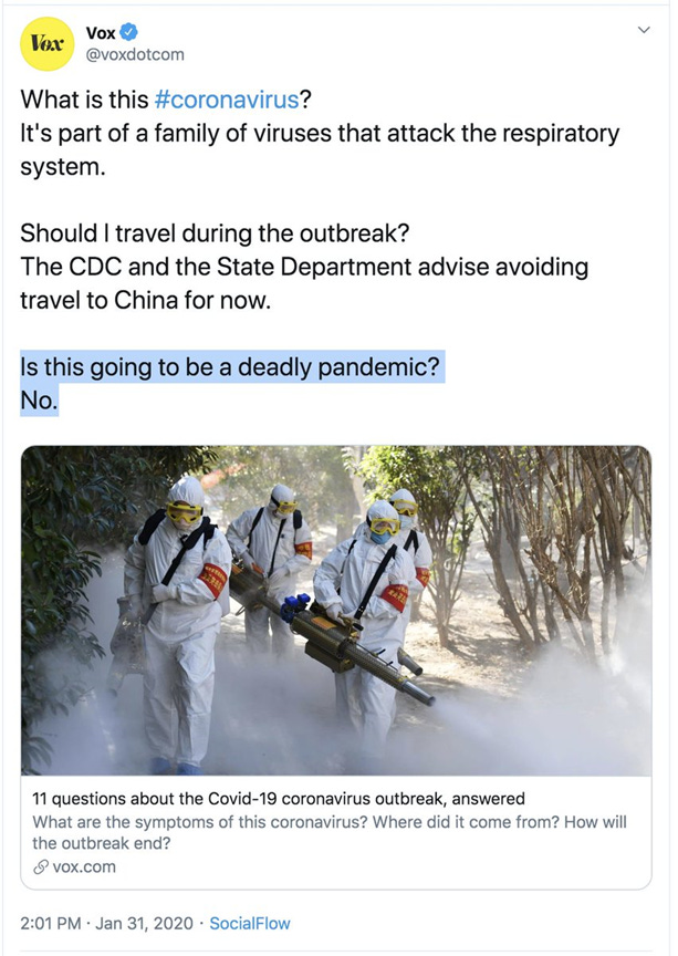
And recall how this spread. It spread down the fashion industry through the world banking hubs. Wuhan is where the garments are made, New York and Milan are both banking hubs and fashion hubs, and London may be the biggest banking hub of all. Those were the places that got bombed first, before anyone knew anything about it, and Vox was still telling everyone it won’t spread here. Check the date:
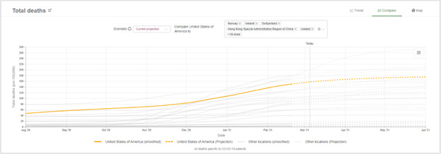
Here’s the IHME plot for the prior bar graph’s data set:
The USA is going to end up about two thirds of the way up this plot, with the countries capable of contact tracing and border security clustered at the bottom.
The clear lesson from these two graphs is that the United Kingdom either vastly fucked up, or they were hit so bad so early that there was nothing they could do. With #Brexit booked they had the tools necessary to lock their border down by bricking up the Chunnel, they just moved too late. And if you wipe out the green bars, this comparison graph looks a bit like the first one. Again, the USA is “pretty bad but vaguely in line with a lot of other countries in our predicament.”
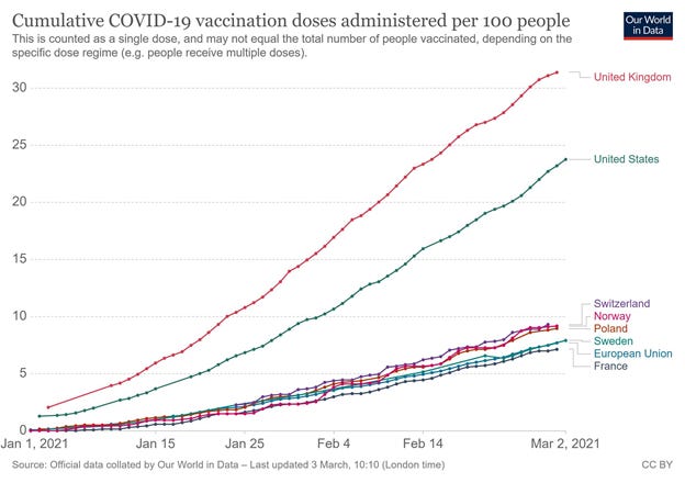
The other narrative I see a lot within Blue media feeds, and promulgated by those who are plugged into those feeds, is to wage culture war about relative vaccination rates of different states. While I think that vaccination rates by state are a valuable thing to look at, the first thing in this discussion should be that every state in the USA is completely spanking every EU nation.
There’s a pretty solid argument that Brexit seriously dragged the EU’s averages down, because they don’t get to ride on the UK’s vaccine numbers. Vaccine skepticism is all over Europe currently, if you take the time to Google it. It’s not just a USA thing. And no healthcare apparatus within the EU remotely compares to what the USA is doing currently in terms of vaccine velocity. Even worldwide, we’re fourth behind the UK, Israel, and the UAE.
The truth of the matter is that the United States has comparable deaths to France, Belgium, Spain, and Sweden, and is smoking those countries on vaccine distribution. It is unassailably true that the USA could have done better, but it is equally unassailably true that the USA is far from the worst country in the world in our Covid-19 response to date.
Just look at the graphs.


